Competitor Comparison Infographics with AI: A 3-Tier Composable Workflow
Sales decks, analyst reports, and content marketing all need *competitor comparison infographics* — head-to-head visuals that let the reader absorb a difference in 10 seconds. Designers used to spend 4-8 hours per comparison; AI templates ship the same artifact in under 10 minutes. What makes the AI shift specifically useful for business news visualization is the **composability**: the same Tesla vs Rivian comparison renders as a sleek minimal data-viz panel for the analyst deck, a retro vintage poster for the brand site, and a founder-vs-founder editorial card for the LinkedIn post — from one prompt parameterization. This guide walks through Curify's 3-tier composable workflow: pick the **subject** (Tesla vs Rivian, OpenAI vs Anthropic, Shopify vs Webflow), pick the **info-type** (head-to-head data panel, founder-vs-founder profile, before/after temporal), pick the **layout/style** (modern infographic, retro vintage, ink-wash editorial, minimal data-viz). Four templates anchor the workflow.
What competitor comparison infographics are actually for
Three concrete use cases drive most of the demand:
1. B2B sales decks. The 'why us over them' slide is the highest-friction moment of a sales conversation. Cleanly rendered competitor comparison panels are worth 1-2 percentage points of close rate on $50K+ deals — multiples of the designer-time cost.
2. Analyst decks. Equity research, market analysis, and consulting decks need one-pager comparison visuals — Tesla vs Rivian on margin trajectory, OpenAI vs Anthropic on model scaling. Analysts produce 5-15 of these per quarter; AI templates ship them at the speed of the thesis rather than the designer queue.
3. Content marketing and journalism. Brand-comparison posts, founder-vs-founder retrospectives, and 'which one should you use' SEO content all live on visual quality. Even mid-tier publications expect rich infographic embeds.
What these infographics are NOT: a substitute for thoughtful analysis. The infographic surfaces the differences the analyst has named — it does not pick them. Template chooses format; human picks axes.
The 3-tier composable workflow
Tier 1: Subject — pick the comparison
Subject = which two (or more) companies are being compared, and which axes matter. The template doesn't pick; the analyst does. Examples that map cleanly:
- Tesla vs Rivian — EV market, margin profile, charging-infrastructure stance, scale curve
- OpenAI vs Anthropic — model capability, safety positioning, enterprise vs consumer focus
- Shopify vs Webflow — B2B SaaS, ICP overlap (commerce vs marketing-site), pricing model
- Stripe vs PayPal — payments scale, developer ergonomics, regulatory posture
- Apple vs Google — platform philosophy, services strategy, AI integration
Each comparison maps to 3-5 axes the reader will skim. Pick axes the reader cares about. *Tesla revenue vs Rivian revenue at end of fiscal year* — true but boring. *Tesla gross margin trajectory 2018-2024 vs Rivian gross margin trajectory 2021-2024* — tells a story.
Beyond 5 axes, the visual reads like a spreadsheet rather than a story.
Tier 2: Info-type — pick the visual shape
Info-type is the structural pattern. Three formats dominate.
Head-to-head data panel — two columns, 3-5 rows of axes, brand colors on each side. The default for B2B sales decks and analyst slide-ins.
Open the Finance Comparison Infographic template →
Founder-vs-founder profile — when the story is about the people running the companies. Inherits the visual language of historical-figure-vs templates (Tesla vs Edison, Galileo vs Copernicus), letting a 2026 founder comparison borrow centuries of design lineage. Best for content marketing and executive-bio LinkedIn posts.
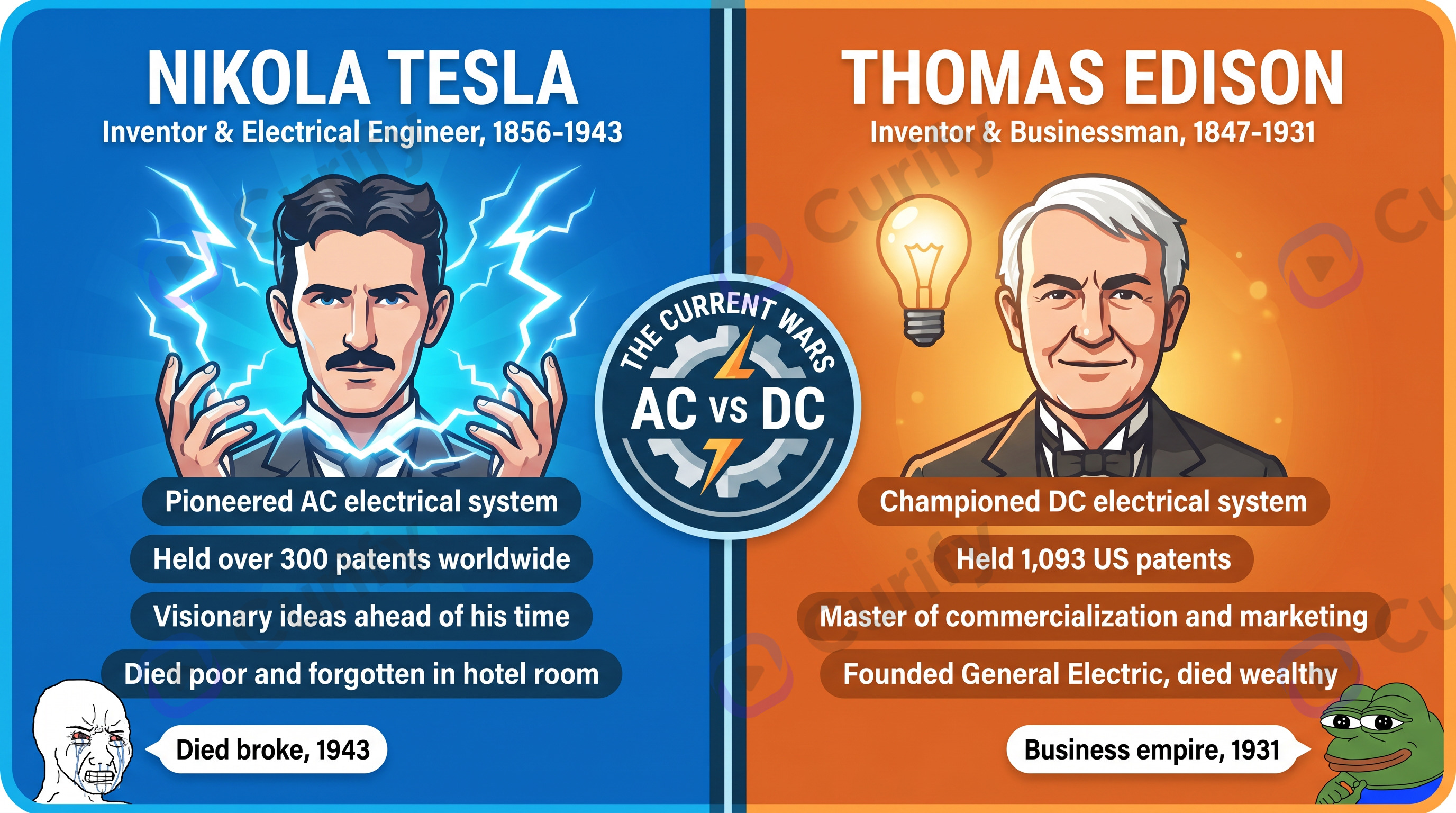
Open the Historical Figure Vs Infographic template →
Before / after temporal comparison — one company at two points in time (post-IPO Stripe vs pre-IPO Stripe), or one industry then-vs-now.
The composability: each subject from Tier 1 can render in any of these three info-types — same prompt parameterization, three downstream deliverables.
Tier 3: Layout / style — pick the design language
Same comparison, different visual register:
Modern data-viz infographic — clean lines, brand colors. Default for B2B sales decks and analyst reports. Reads as 'recent, considered, on-brand'.
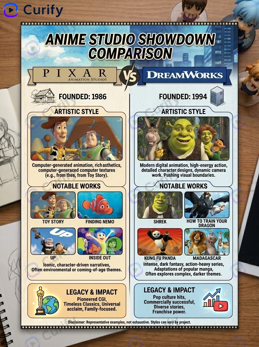
Open the Animation Studio Comparison Infographic template →
Retro vintage poster — bold flat color, art-deco type. Best for brand site embeds where the comparison is part of the editorial voice.
Ink-wash editorial — softer, handcrafted register. Best for narrative-argument content (founder retrospective, industry-shift essay).
Minimal data-viz — almost spreadsheet-like, axis-line-heavy. Best for executive-bio LinkedIn or Twitter image embeds where the comparison supports a longer thread.
Choose style based on where the visual ships, not what the comparison is. Tesla vs Rivian is a data-rich head-to-head if it's an analyst report; a founder-vs-founder vintage poster if it's a long-form magazine piece.
Putting it together: 4 worked examples
The 3-tier composability becomes concrete when you compose all three axes on one business news event.
Tesla vs Rivian (EV) — Subject: Tesla vs Rivian. Info-type: head-to-head data panel (margin profile, ASP, gross margin trajectory, energy mix). Style: modern infographic. Use case: equity research one-pager.
OpenAI vs Anthropic (AI labs) — Subject: OpenAI vs Anthropic. Info-type: founder-vs-founder (Sam Altman vs Dario + Daniela Amodei). Style: ink-wash editorial. Use case: long-form magazine feature on AI safety positioning.
Shopify vs Webflow (B2B SaaS) — Subject: Shopify vs Webflow. Info-type: head-to-head data panel (ICP, pricing tiers, developer share). Style: minimal data-viz. Use case: B2B SEO comparison post for 'shopify vs webflow'.
Stripe vs PayPal (payments) — Subject: Stripe vs PayPal. Info-type: temporal (Stripe 2010-2025 vs PayPal 1998-2025, parallel timelines). Style: retro vintage poster.
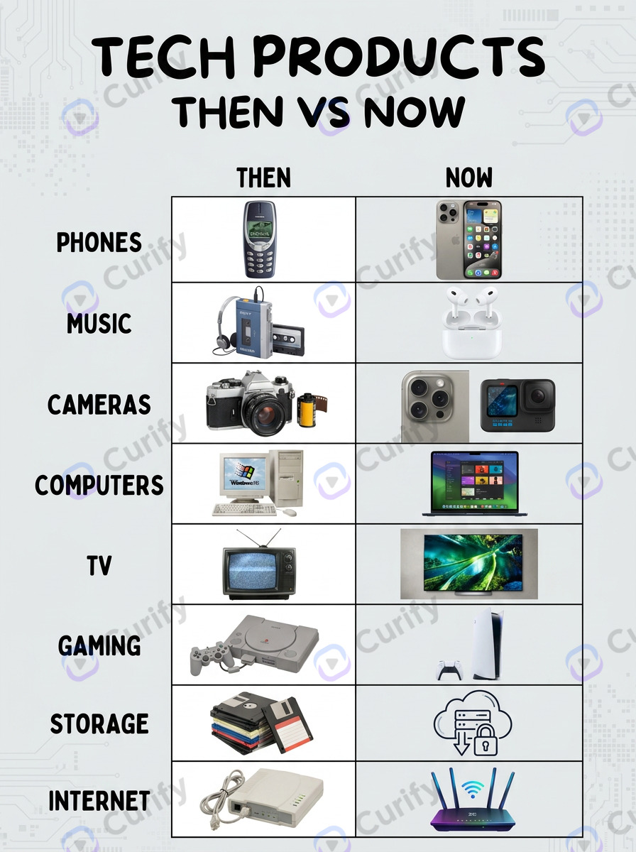
Open the Then vs Now Comparison Infographic template →
Each is one parameterization-swap from a different example. The engine handles rendering; the analyst handles the subject + axis pick.
Where AI comparison infographics still need a human (and where the comparison engine stops)
Three limits inside the comparison engine, and one boundary where you reach for a different template entirely:
Picking the axes is human work. AI templates render the axes you specify; they do not figure out which ones matter. A Tesla vs Rivian comparison built around the *wrong* axes (quarterly revenue rather than gross margin trajectory) ships fast but does not convince.
Data accuracy is your responsibility. AI templates render the numbers you input. If you put Q3 2025 revenue rates that turn out to be Q2 2025 numbers, the infographic is wrong. Pull from primary sources (10-K, 10-Q, ARR press releases) and double-check before generating.
Brand-color conflicts are template-bounded. If your comparison subjects' brand colors clash (Stripe purple vs PayPal blue), the template does not auto-resolve. Manual palette override is usually a 30-second adjustment but worth doing intentionally.
Tone is template-shaped, not param-shaped. A given template renders one tonal register; reparameterizing a kawaii-pastel template will not produce serious corporate-news output. Worked example: the same Meta layoff news event rendered through a sports-iconic poster (gold-metallic mismatch), a kawaii weird-science-facts infographic (catastrophic — smiling severance coins), a hot-event-analysis 3-tier infographic (strong as a companion piece, but portrait, not a hero), and Curify's new template-corporate-news-editorial-hero (monochrome with Meta-blue accent, 3:2 landscape — hit the publisher's editorial bar on the first generation). Tone = template choice. Curify ships sibling templates for editorial-hero / strategy-pivot / funding-announcement / regulatory-action info-types in the same 3-tier taxonomy. Reach for a comparison template when the story is X-vs-Y; reach for an editorial-hero template when the story is one company's narrative pivot.
Tools & Resources
Learn about the best tools available...
Two engagement models for analyst, marketing, and sales teams
Model A — Per-comparison turnkey production. For sales, analyst, or content teams that need 5-20 comparison infographics per quarter without rebuilding the AI workflow internally, Curify produces the comparison set on per-asset pricing. Submit the axes (3-5 per pair), the desired info-type + style, and the data; we ship 24-48 hours. Best fit: small B2B sales teams, equity research desks, content marketing teams running 'X vs Y' SEO content at scale.
Model B — Workflow licensing for in-house design ops. For larger teams that want the 3-tier composable workflow as part of their stack, Curify ships the comparison engine as API endpoints + configurable templates. Best fit: 20+ comparison assets per quarter, multiple downstream consumers (sales + analyst + marketing + journalism on the same engine).
Both paths preserve the core promise: 3-tier composability — same Tesla vs Rivian comparison renders three different ways for three different downstream uses.
This competitor-comparison workflow is one slice of Curify's visual-search-and-generation engine. The same composability extends to *Apple 1976-2026 timeline* (subject × timeline info-type × style) and other business news visualizations. Sibling guide forthcoming: Company Timeline Infographics.
Ship one comparison this week
Pick the one competitor comparison weighing on your next sales review, analyst publication, or content sprint and ship it with one of the templates above. The 3-tier workflow is fast enough that the time investment is well under an hour from comparison-picked to infographic-rendered.
Reach out via /contact for the per-comparison or workflow-licensing engagement.
Popular Template Examples
Explore our most popular Nano Banana prompt templates to see what's possible:
Take the next step
Putting what you read into practice.
Related Articles
DS & AI Engineering
From Probabilistic to Deterministic: Hard Truths About AI Engineering in Production
The AI Content Factory: Why Marketing Agencies Need to Stop Buying Tools and Start Building Pipelines