Industrial-Grade AI for Illustrator IP: Why Generic Models Fail on Series Consistency, Pattern Precision, and Print Readiness
A cultural-creative studio owner in the SF Bay Area messaged us last week with one of the cleanest framings of the AI-for-illustration problem we have heard: *pure hand-drawing is too slow, but AI integration has not worked either*. His company has both an in-house illustrator and a production factory; the bottleneck is the seam between the two. This post is the diagnostic frame from that conversation — three specific defects of generic image models on illustrator-IP / blind-box / merchandise production, and the deterministic-workflow approach that closes each one. Proof assets are real outputs from the engagement, regenerated alongside the original failing samples. 
Why merchandise and blind-box production has a unique AI bar
Consumer image AI is judged by one bar: does the output look good on a screen. Cultural-creative merchandise and blind-box production is judged by a completely different bar: does the file survive embossing, gold-foil stamping, mold-cutting, and registration color separation on a real production line. Pretty-on-screen is necessary, nowhere near sufficient.
Three concrete factory-side standards most AI outputs fail:
1. Pattern repeatability under high-precision printing. A taotie motif, thunder pattern, or inscription on a bronze-vessel mascot has to be a precise repeatable historical motif — the kind a designer can later cut into a mold or vectorize into clean Bézier paths. Generic AI tends to render these as random meaningless lines that look approximately right at thumbnail and fall apart at production zoom.
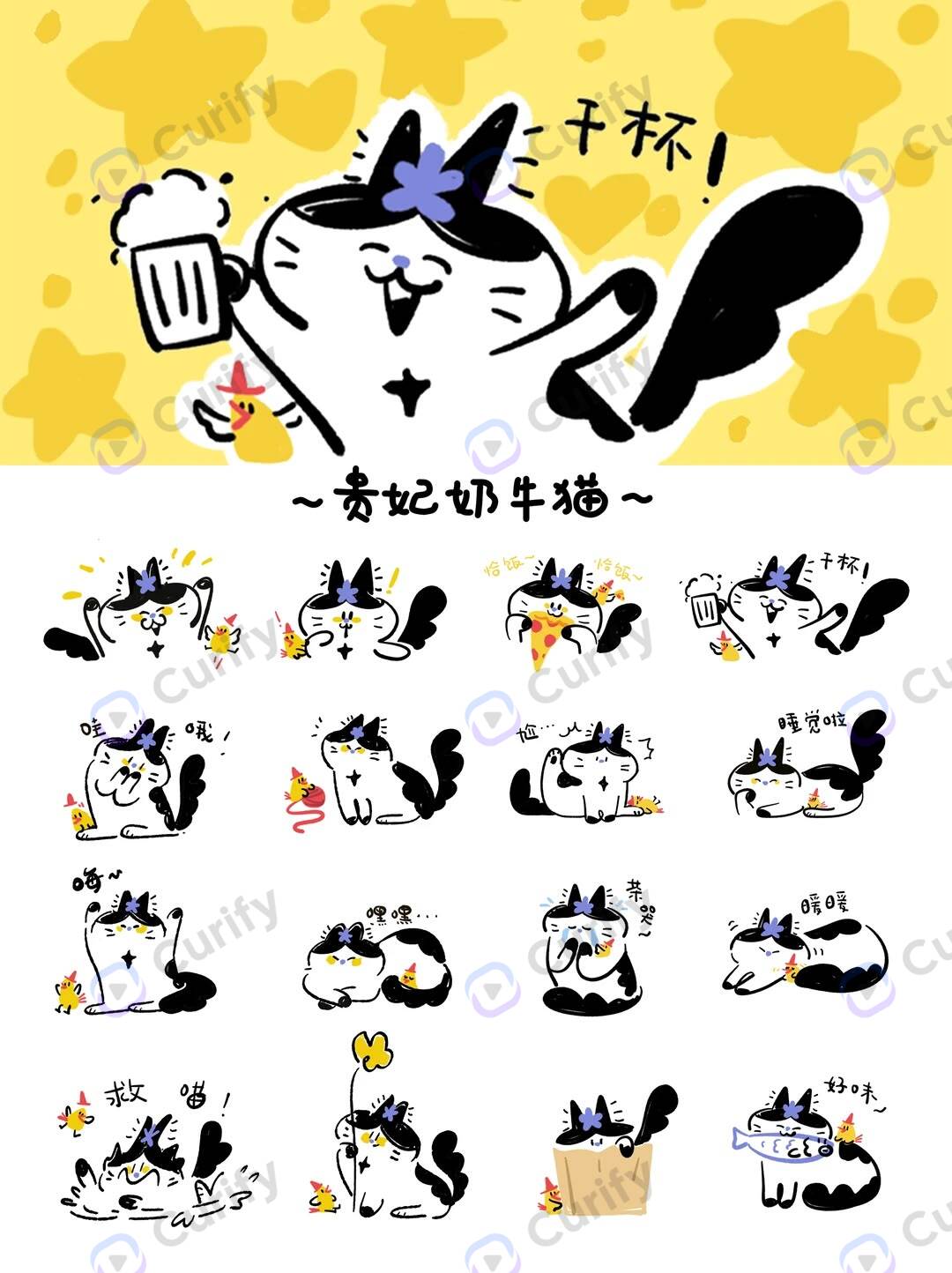
2. Series consistency across 8 to 12 pieces. A blind-box series is sold as a set. The mascot has to read as the same character across every relic — same fur texture, same eye proportion, same ear silhouette. Generic AI drifts on these features every time surrounding context changes. The series stops being a series.
3. Linework that meets print standards. Outline weight has to be consistent. Gradients have to be clean enough to vectorize. No chromatic aberration on edge transitions. Designers ultimately trace generated art into production-ready vector files — generic AI outputs need 60-80% rework before they are usable.
The studio owner's own observation captured the gap: *AI's pain is weak creative judgment, but production capability is real*. The implication: the layer that needs to be added is not better generation — it is better authoring above the generation.
Three defects of generic AI for merchandise IP, and the deterministic-workflow fix
Defect 1: Pattern AI slop
The cleanest case study is the bronze-vessel mascot. Bronze culture has a finite, well-documented vocabulary of decorative motifs — taotie, kuilong, phoenix, thunder, cicada, panchi — each with specific topological structure (symmetric eyes, registered horns, repeating spiral cells) catalogued in art-history references for centuries.
The failure mode is consistent across consumer image models: prompted with *bronze-vessel taotie pattern bronze cat mascot*, the model produces output that reads as bronze-textured at thumbnail and dissolves into random brush noise at production zoom. The taotie face has no symmetric eye pair. The thunder band is approximately-spiral-shaped fills rather than the precise repeating-square spiral bronze artisans used. The inscription strip is squiggled lines, not characters.
Why this happens: bronze-motif vocabulary is *unseen historical vocabulary* in the model's training distribution. Image-generation models saw billions of photos of cats and very few photos of correctly-rendered Shang-dynasty taotie at production detail. Standard control-net approaches don't save you — depth, pose, and edge maps don't encode the *semantic content* of the motif, only its rough shape. The model still hallucinates the interior detail.
The fix is to inject the motif as a *control condition with semantic content*, not just shape. Curated reference plates for each motif (taotie, dragon, thunder, cicada) become layer inputs that the generation conditions on at finer granularity than control-net depth. The taotie keeps its symmetric eye pair, the thunder band stays a precise spiral repeat, the inscription becomes actual character glyphs rather than squiggle. Section 4 shows the working version on the same source sketch.
Defect 2: Series inconsistency
Series work is where the studio owner's pitch landed: *generating series is exactly the focus, like an ancient-bronze + cute-mascot combination set*.
The production reality: a blind-box series of 12 must be visibly the same illustrator's hand. The mascot's fur grain, eye-pupil shape, ear silhouette, and proportional ratios cannot drift from piece to piece. The decorative-vessel context will change — one piece sits inside a ding bronze vessel, the next inside a gui, the third inside a gong, each with totally different period palette and motif vocabulary. The series cohesion comes from the mascot, not the vessel.
Generic image AI cannot hold this. Every time the surrounding prompt changes context (different relic, different palette, different lighting), the mascot's identity drifts. Run the same prompt twice and the cat has a different face. Run it across 8 different relics and the cat has 8 different faces — the buyer cannot tell it is a series.
The control problem is character identity persistence under prompt-context shift. The fix is to lock the mascot's numeric proportions and style reference as a separate layer the generation must respect across runs — independent of the relic context. Series cohesion becomes a deterministic constraint, not a hope.
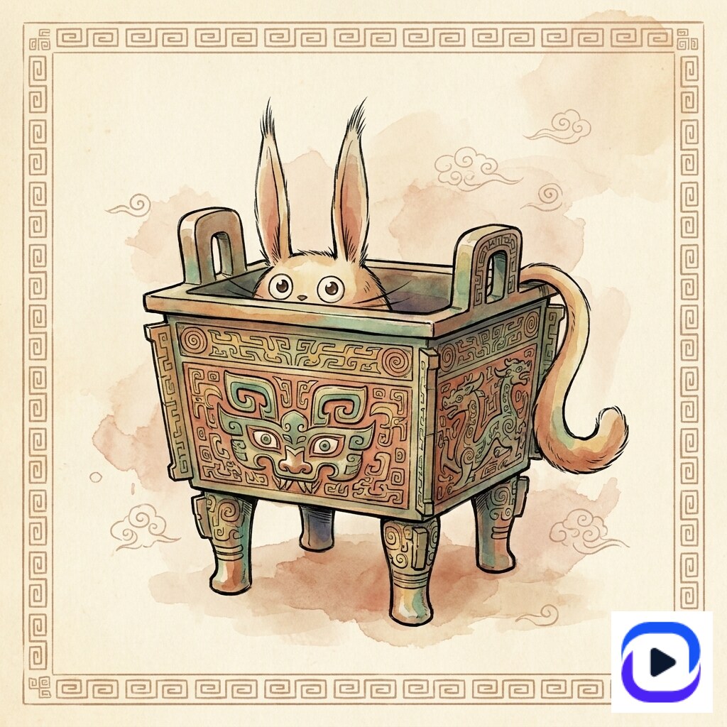
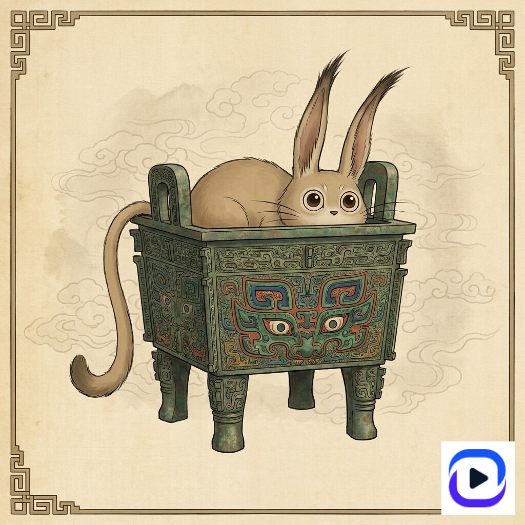
The proof for the SF Bay Area studio was a two-piece series demo: same cat mascot, rendered into two different relic contexts (a bronze ding and a pig-zun). Same identity. Different vessels. Different palettes. Holds:
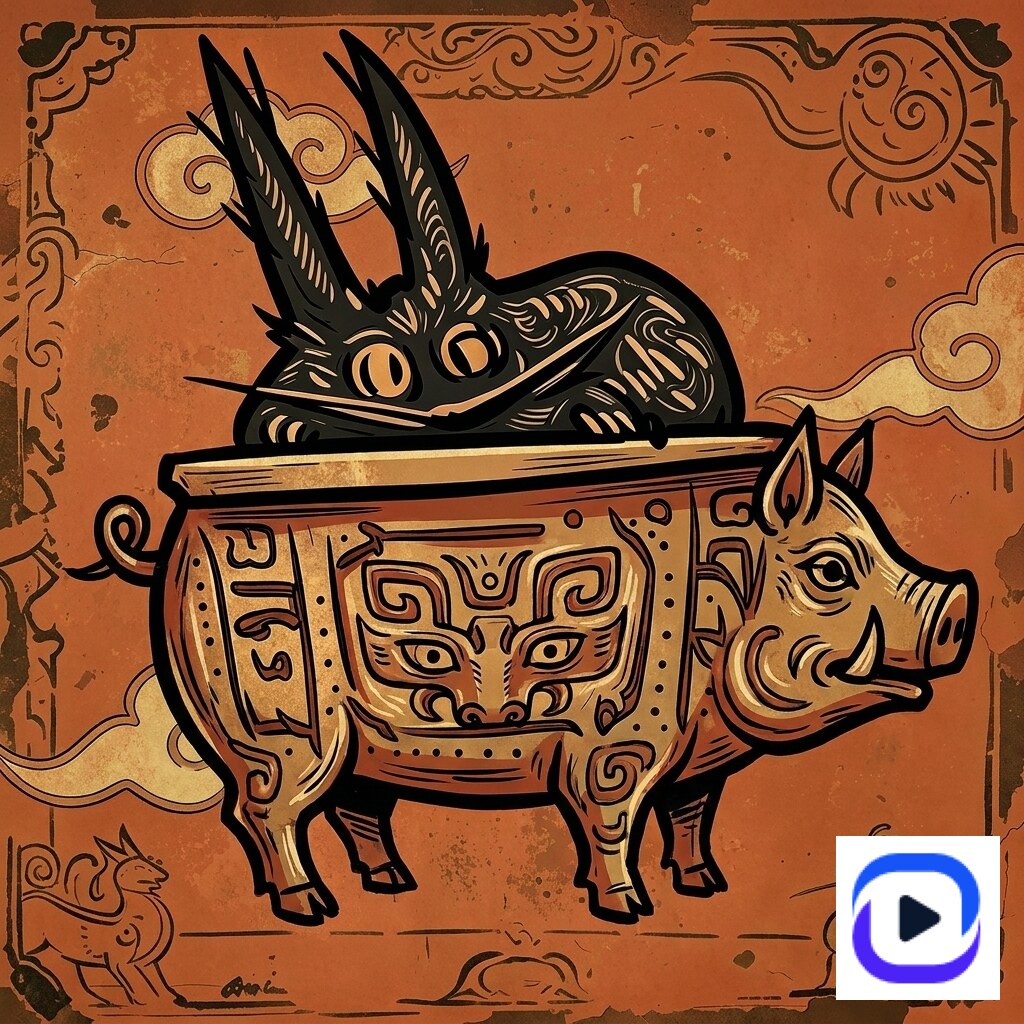
What is held constant (mascot face, fur, eyes, proportions) and what varies (relic, palette, decorative-motif vocabulary) is the visible signature of series-consistent generation.
Defect 3: Linework fails print standards
The third defect is invisible at consumer scale and unforgiving at production scale. Embossing requires outline weight consistency — a line that varies between 0.4mm and 0.9mm cannot be embossed cleanly because the mold step needs a single registered depth. Gold-foil stamping requires sharp, unambiguous foil regions — fuzzy gradient edges produce ghost foil that has to be reworked by hand. Factory mold-cutting requires lines that vectorize cleanly into Bézier paths — gradient noise and chromatic aberration produce broken-up vector traces the designer has to manually clean stroke-by-stroke. Registration color printing requires color regions with crisp boundaries — anti-aliased dithering across a color boundary produces misregistration on press.
Generic image-model output fails most of these at the same time. The lines are uneven. Gradients have noise. Edges have chromatic aberration where the model interpolated between adjacent training samples. Designers receiving these outputs cannot trace them into clean production files — the 60-80% rework figure the studio owner cited is conservative for high-precision pieces.
The fix is upstream of the model: a layout-fixing layer that locks topology of the source sketch before generation runs, so the model cannot move lines around. Combined with a vector-friendly aesthetic-template borrow (intangible-heritage, watercolor-sketch, ink-watercolor styles ship as Curify templates with print-friendly line discipline already built in), the output drops to roughly 10-20% rework — territory where the designer can actually use the file.
This is also where most consumer AI tools stop being useful. Print-readiness is not a prompt-engineering problem. It is a workflow problem that lives above the model.
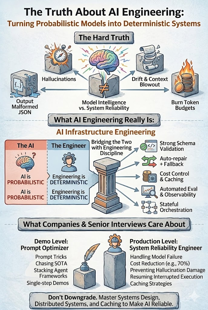
The Curify deterministic-workflow fix (four mechanisms)
The four-mechanism stack the studio owner saw a working version of:
1. Structure constraint (Fix Layout). The topology of the source sketch is locked. The model cannot redraw the pose, move limbs, or reorganize the composition. Foundation — without it, the rest is unstable.
2. Semantic injection (Element Inject). Standard motif vocabulary (taotie, thunder, dragon, cicada) is injected as control conditions with semantic-level content, not just edge shape. Generated detail matches real artifact references. Bronze patterns stop being scribble.
3. Character lock (Consistent Mascot). Fixed numeric proportions and style reference for the mascot across the whole series. The mascot reads as one illustrator's hand across all 12 pieces.
4. Matched-aesthetic template borrowing. Borrow palette and decorative vocabulary from a proven Curify template (intangible-heritage, chinese-classic-character-mbti, princess-pearl-mbti, national-culture-infographic) but render the hero subject only — no infographic scaffolding. The template provides print-friendly line discipline as a free side effect.
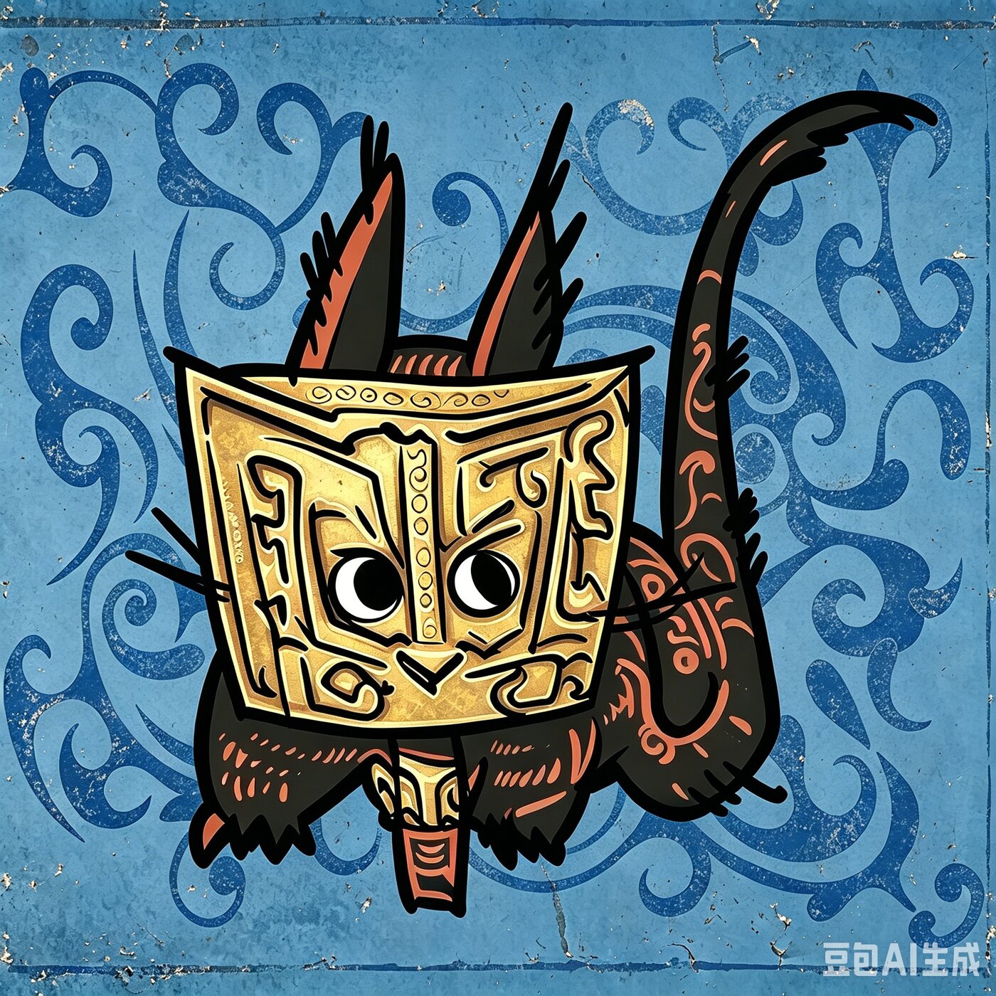
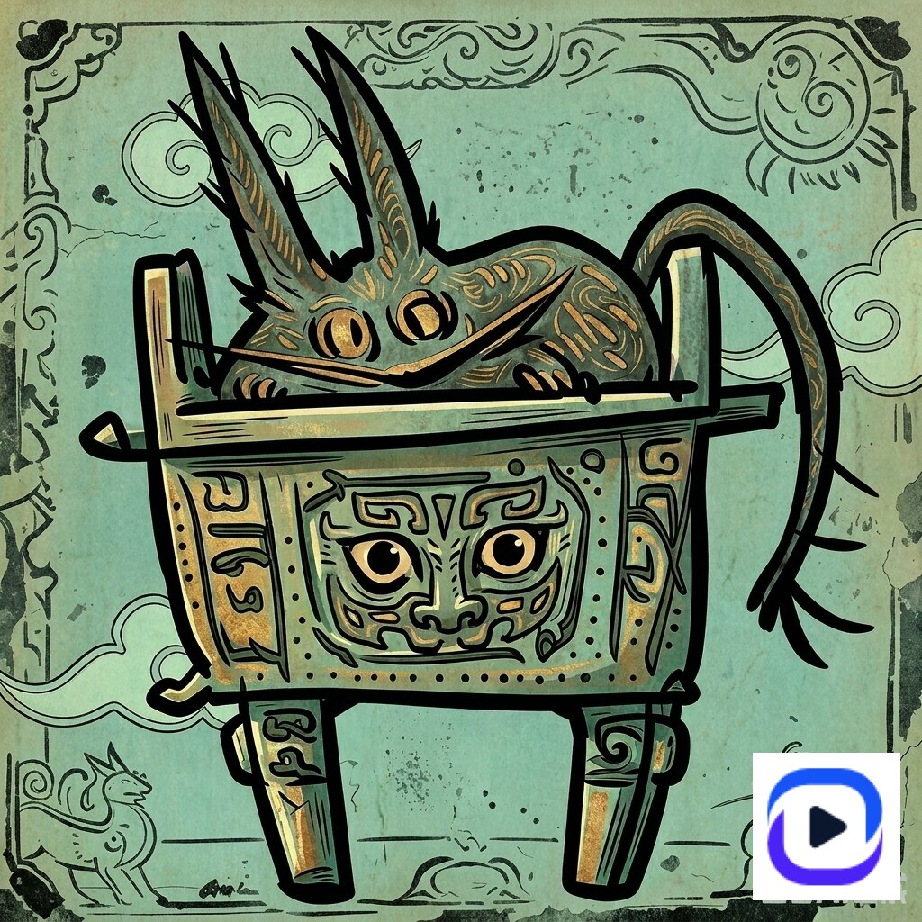
The four-style explore set the studio owner saw, on the same source sketch (mascot bronze-vessel concept):
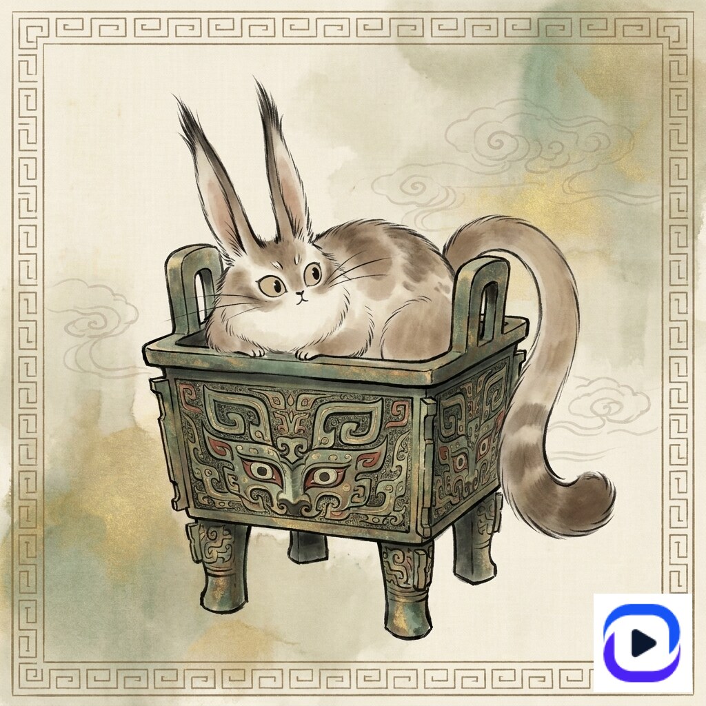
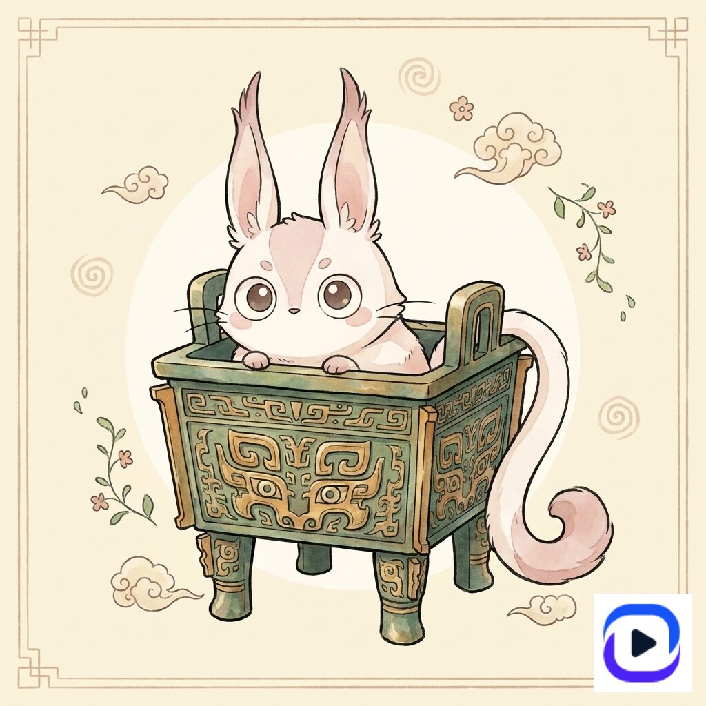
Four distinct aesthetic registers. One held mascot identity. Print-friendly line discipline across all four. No pattern slop on the taotie or thunder bands. The studio owner picked the *great-way-through-simplicity* variant — the QQ-cute watercolor-sketch style — as the production winner during the live review.
Once the deterministic-quality mascot is generated, downstream production templates ship the SKU formats:
![]()
Open the IP Character Sprite + Emoji Sheet template →
Open the IP Emoji Sticker Sheet Poster template →
Open the IP Gift Box Stationery Set Mockup template →
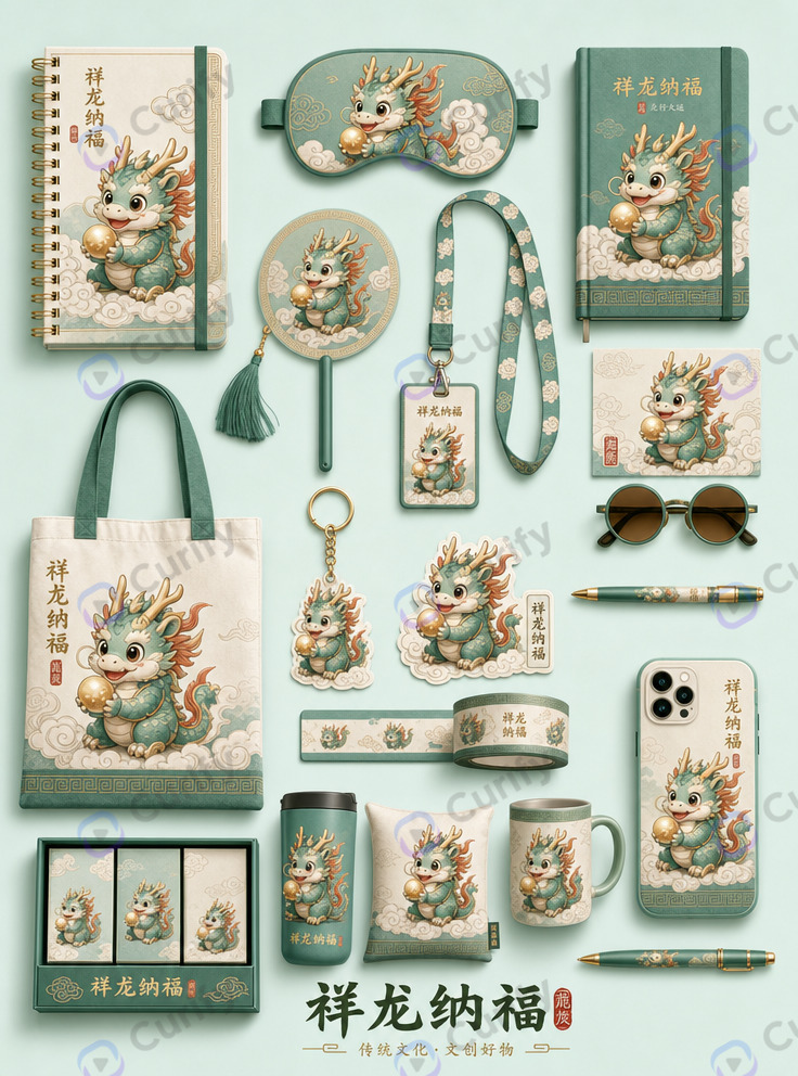
Open the IP Creative Cultural Goods Mockup Set template →
These close the loop: sketch → mascot → series → factory-ready SKU mockups, in one Curify workflow.
Where this approach still has limits
The deterministic-workflow fix is not unconditional. Three places it still falls short:
Input sketch quality is a floor. Structure constraint locks the source topology, which means a low-quality source produces a controllable but still low-quality output. The illustrator has to produce a clean sketch first. The pipeline scales the output of a talented hand — it does not replace one.
Matched-aesthetic template must exist in catalog. The four-style explore set worked because Curify's catalog covers intangible-heritage, chinese-classic-character, princess-pearl, and national-culture styles. A genuinely novel aesthetic register that does not match any existing template requires either a new template authoring pass (1-3 days) or working without the aesthetic-borrow boost (output remains usable but does not benefit from the print-friendly side effect).
Series cohesion caps at roughly 12 pieces. Character identity stability holds reliably across 8-12 pieces in one batch. Beyond that, drift accumulates and the mascot starts looking subtly different across the tail of the series. Mitigation: retrain the character anchor between batches — a half-day process for studios shipping >12-piece sets.
B2B procurement is not viral generation. Studios buying this engage as procurement — pricing conversations, sample reviews, contract terms. Expect a 2-6 week buy cycle, not an instant signup. That is the right shape for a high-fidelity production engagement, but materially different from consumer AI's free-tier-to-upgrade funnel.
Tools & Resources
Learn about the best tools available...
Two engagement models for illustrator and merchandise studios
The studio owner asked the right framing question early: *what is the business model and pricing?* Two paths, depending on what the studio actually needs:
Model A — Turnkey white-label SKU production. For studios that want SKUs without rebuilding their AI workflow internally, Curify produces batch white-label series sets at tiered per-piece + per-batch pricing, with long-term partnership discounts. The studio supplies 2-3 reference illustrations or an existing mascot character sheet; Curify produces a series of N pieces matched to factory-print standards. Best fit: small-to-mid studios with a strong creative bench but limited AI/ML engineering capacity, and brands that need a clean cultural-creative derivative line for a campaign.
Model B — System licensing and workflow API. For studios with their own designer + factory pipeline who want to bring the deterministic workflow in-house, Curify ships the system as API endpoints and configurable workflow components. The studio integrates against their existing asset management, runs their own batches, and keeps the creative judgment internal. Best fit: larger studios with mature design ops who treat AI as production infrastructure, and IP-holding brands shipping >50-piece annual catalogs.
Both paths preserve the core promise: whether we provide the underlying workflow or directly generate the assets, the deterministic-quality guarantee holds.
The studio owner's response to seeing the four-style set: *this one is best — the others are fine*. That kind of clear pick from a working illustrator on real production work is the validation signal the post is built around.
If you are running an illustrator IP studio, talk to us
If you are running a cultural-creative, blind-box, or merchandise studio and you are running into the three defects this post diagnoses — pattern slop, series inconsistency, print-fail linework — talk to us. We are based in the SF Bay Area, work with studio leadership directly, and structure engagements to match where you actually are: Model A turnkey if you need SKUs delivered, Model B licensing if you want the workflow in-house.
Reach out via /contact for an initial scoping conversation. A first sample iteration (one mascot, one relic context, one matched-aesthetic style) takes 2-4 days from receiving the source sketch. The conversation that produced this post took roughly 90 minutes; the production pipeline took 3 days from first sketch to four-style explore set with two series-consistency pieces. Engagement timelines for actual partner studios are similar — fast enough to evaluate against a real catalog season, slow enough to do quality work.
Browse related topics
More templates and prompts in these areas.
Related Articles
design-branding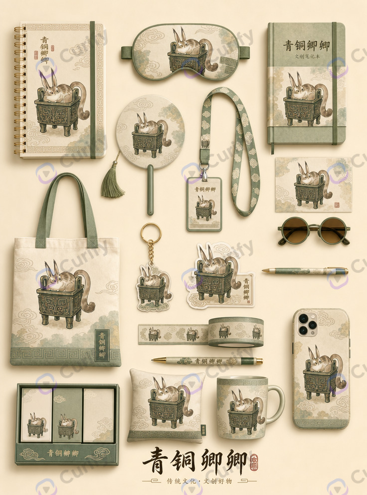
Designer Toy IP Merchandise Design: The 2026 AI Production Workflow
The AI Content Factory: Why Marketing Agencies Need to Stop Buying Tools and Start Building Pipelines