Join Curify to Globalize Your Videos
By using Curify, you agree to our
Terms of Service and Privacy Policy
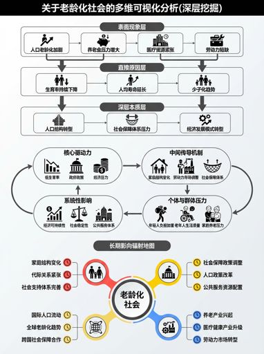
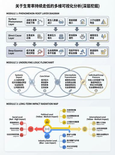
Nano Banana Prompt: Hot Event Multidimensional Analysis Diagram Generator
Generate a 3:4 Chinese hot-event analysis infographic with layered causality, mechanism chain, and impact radar maps.
Customize & regenerate
This template is published fresh by Curify on a recurring cadence — the latest version is above. You can also fill in your own parameters and generate a custom version below.
Open customize panel▾
Generate a visual infographic on hot events: portrait 3:4; text in English with clear and separate layers; white background. Title: Multi-dimensional visual analysis with AI — 【{event_title}】 (in-depth exploration). Content structure: 1) Phenomenon-Essence Layered Diagram: from top to bottom “Surface Phenomenon Layer → Direct Cause Layer → Deep Essence Layer,” with arrows indicating causal relationships; 2) Underlying Logic Breakdown Diagram: process chain “{logic_chain},” labeling subjects, actions, and results; 3) Long-term Impact Radiation Diagram: radiating from the event towards {impact_axes}, labeling impact content and duration (short/medium/long), using colors to distinguish impact levels (red high/yellow medium/blue low).Other nano banana templates
Explore other categories and presets.


About this template
What is this template?
This template combines Nano Banana prompts to deconstruct complex events into 'multidimensional analysis diagrams': layering the phenomena and essence, clearly presenting causal chains and long-term impacts.
Who should use it?
Suitable for hot topic interpretation accounts, industry analysis/business observation, product/operation reviews, structured writing for graduate students, and those who want to explain complex events logically.
How to use it
- Input a one-sentence summary of the event + timeline (3–6 key nodes).
- List the participants (at least 3 categories: platform/regulation/user/industry chain, etc.) and their motivations.
- Require a three-layer structure: phenomenon vs essence, underlying logic chain (cause → effect), impact radiation (short/medium/long).
- Check after generation: is it 'opinion first'; if biased, let the model 'first provide a factual framework, then give multiple perspective hypotheses'.
Example prompts
- Generate a multi-dimensional analysis chart of a hot event: event 'controversy triggered by a certain platform's algorithm recommendation mechanism' (in neutral wording), including timeline nodes, participant motivations, causal chain, short, medium, and long-term impact radiation, with high readability Chinese layout, 3:4 portrait.
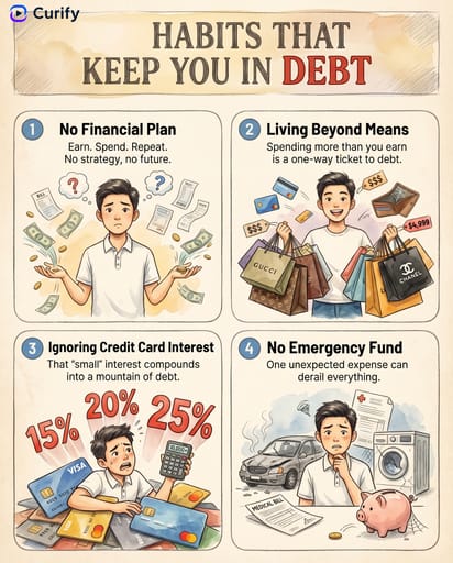
- Create an analysis chart for the 'mass layoffs' event: layered phenomenon and essence, cost/growth/organizational structure logic chain, impact radiation on employees/industry/capital market, 3:4.
- Generate a retrospective infographic on 'a product launch failure': key nodes, root cause chain (demand/engineering/communication), remedy path, long-term impact, 3:4 portrait.